There are times, when designing your website layout, that there are just no more content you can add, or you just decide at some point that this is it. I'm not adding any more content. This is a decision you can make, and when you do, you can use whitespace to handle larger devices.
Case study: Create Digital Media

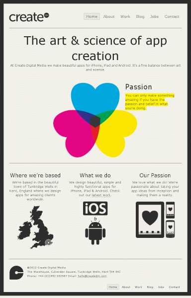
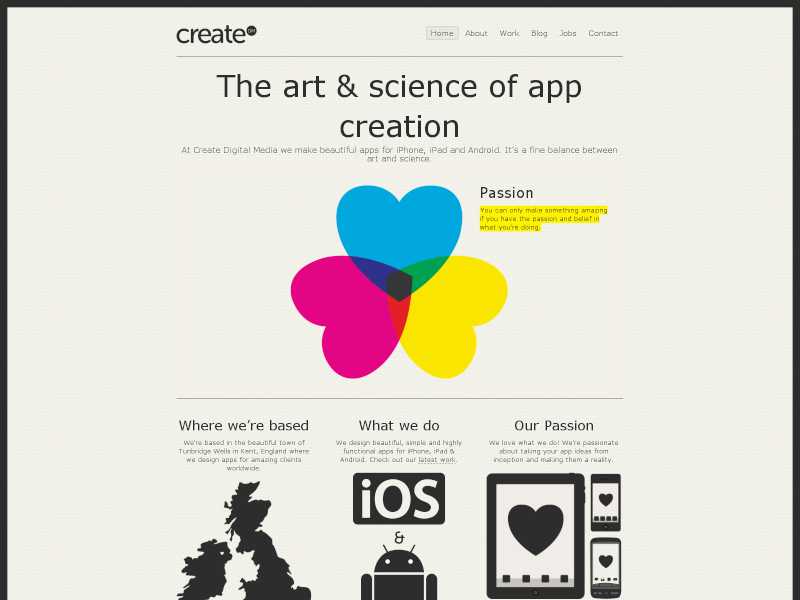
Notice the use of whitespace on Create Digital Media's desktop site. From their tablet design, they have used a certain layout on which there are no more columns to be added. It can also be assumed that they have no other relevant content to show on their website, so for the larger display, they handle the responsiveness by using whitespaces on both sides. Whitespaces can also be used on one side.
When using whitespace, be very aware of your overall design. The use of whitespace is easy and can be effective, but if you use your mobile design and just use whitespace to make you desktop design, it can be very empty.
This method works best when you have no additional contents to add to the layout, and when you've done other techniques we've discussed previously.