One of the most common way to handle responsive design in the industry is changing the flow of blocks of layout elements. Grids and columns are the base foundation of this technique. In mobile design, layouts are most likely done in single columns, so it is also important to group things together before using this technique.
Case study: Erik Ford


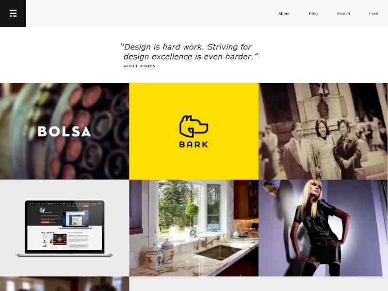
Erik Ford's gallery has different numbers of columns according to the device size.
Notice the gallery from the example above. When the width of the screen increases, elements that are originally vertically stacked slowly becomes horizontally spanned. As more space opens up, the number of columns increases.
This method works best for list items or blocks of elements with the same level of priority.