As discussed in the previous lesson, we should always design for mobile first. Now, once we have our mobile design, we would want to adapt the design to serve larger devices. The first technique to do this, a very obvious way to fill up screen, is scaling layout elements.
Case study: Hirondelle USA

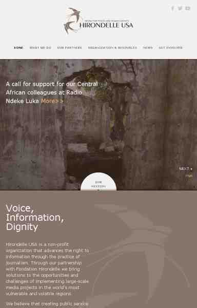
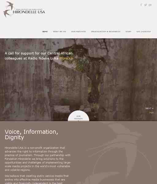
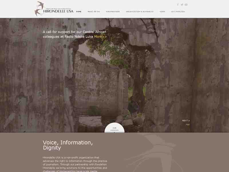
Scaling elements in the layout is a common way to do responsive design. However, it is important to consider the original width of the image, or in the case of text containers, the line width and height. You don't want to stretch the image so far that it gets pixelated. For texts, you also don't want all your paragraph in one very wide line. If you see the example website above, the text in the brown text container has relatively the same width on netbook and desktop. This is to anticipate a very wide desktop on which the text may span across one or two lines, which wouldn't look good. This kind of detail is what you should consider as a designer.